09/10/2025

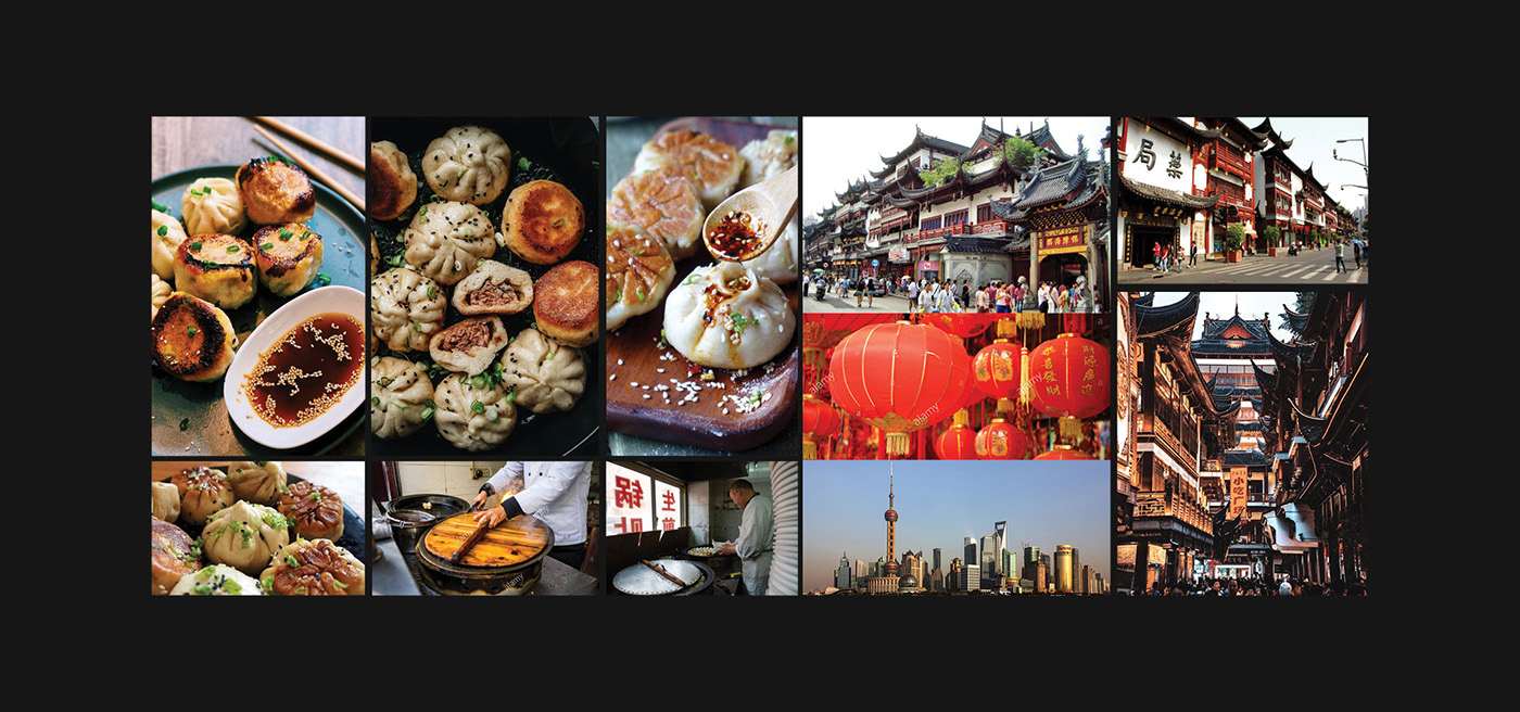
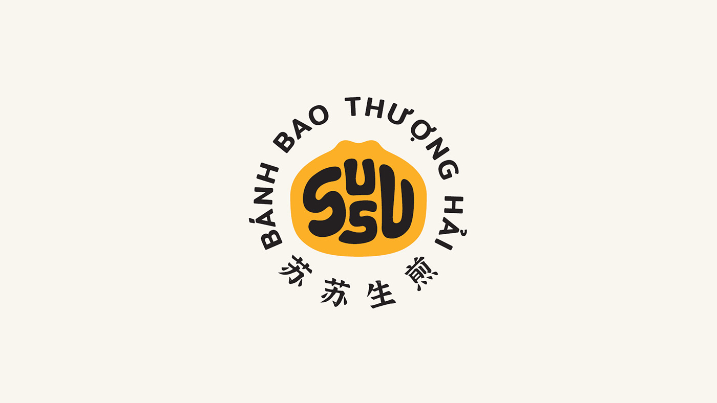
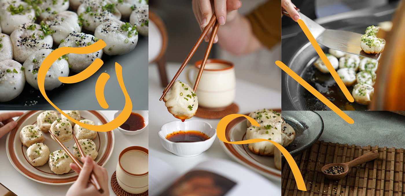
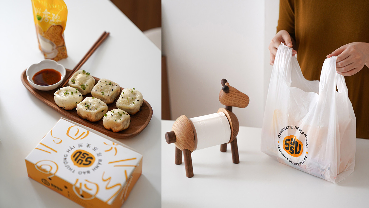
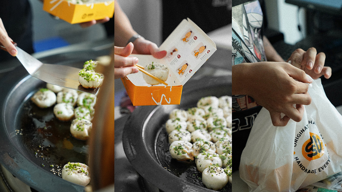
SUSU is a fun little spot in Hanoi that serves up tasty Shengjian bao — those juicy, pan-fried buns filled with meat and soup that originally came from Shanghai. The idea behind SUSU is to bring the real taste and vibe of Shanghai to Vietnam, but with a modern, fresh twist.
Our task was to build a brand identity that really shows what SUSU is all about: fun, friendly, fresh, and full of flavor. We wanted to capture the spirit of the bao — it’s more than just food, it’s a little bundle of happiness and comfort. At the same time, the identity needed to reflect the playful, lively feel of the restaurant, where people can relax and enjoy their bao in a cozy, colorful space.
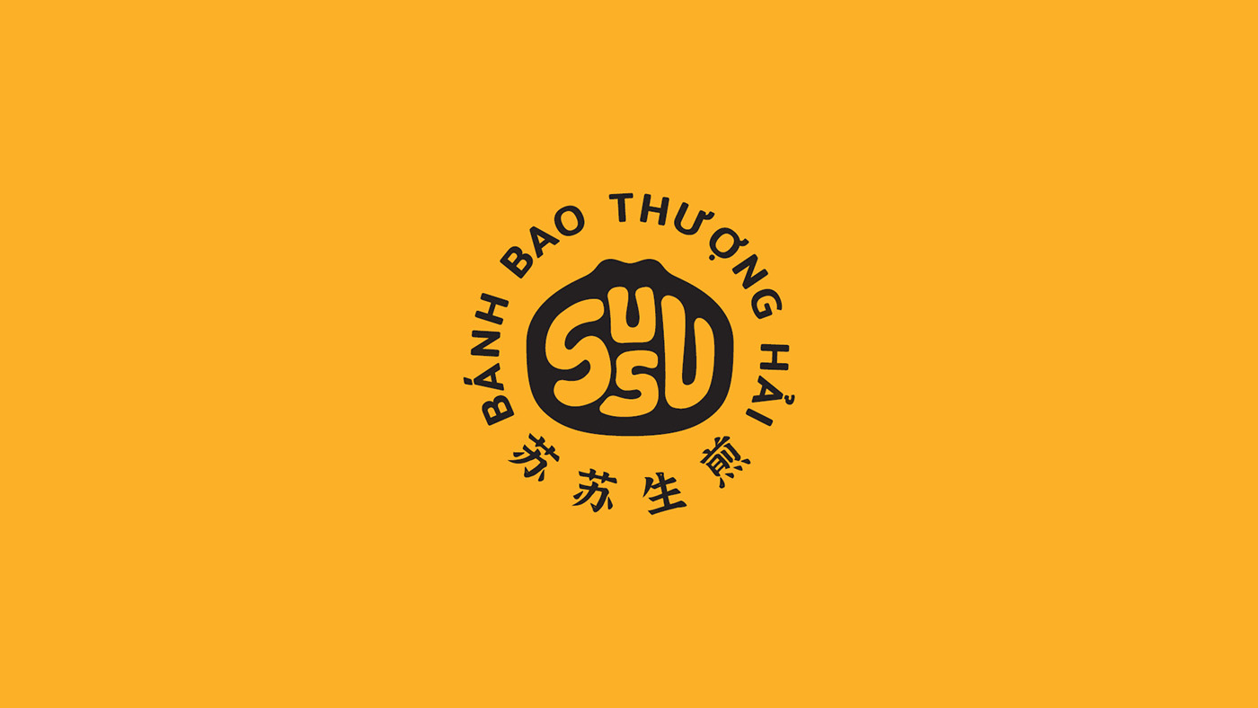
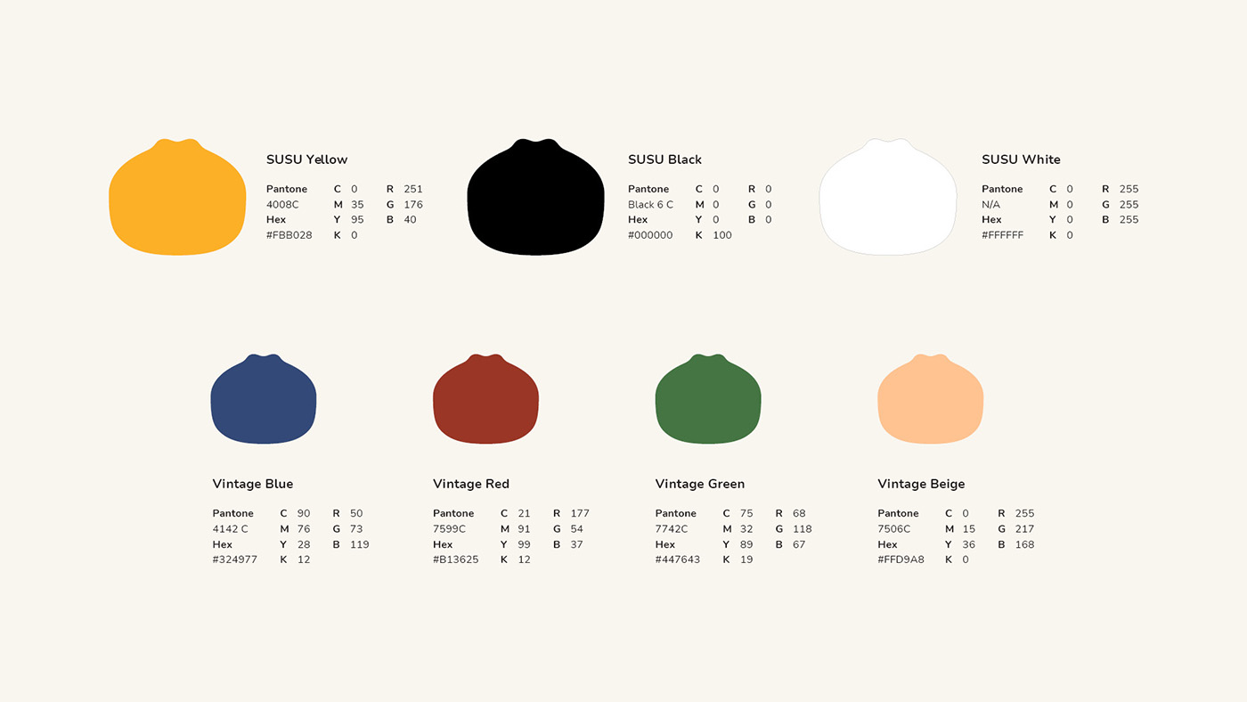
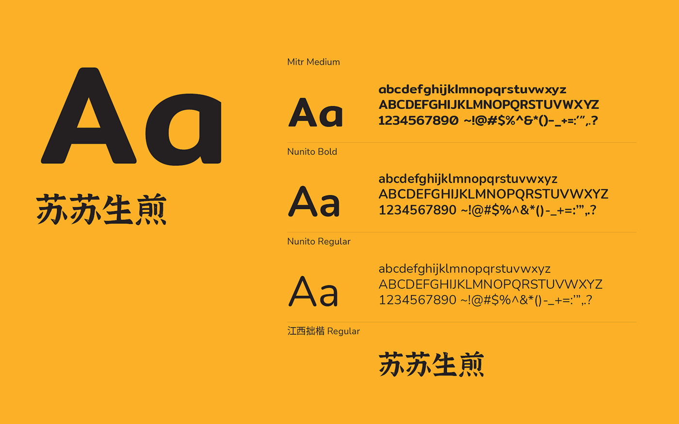
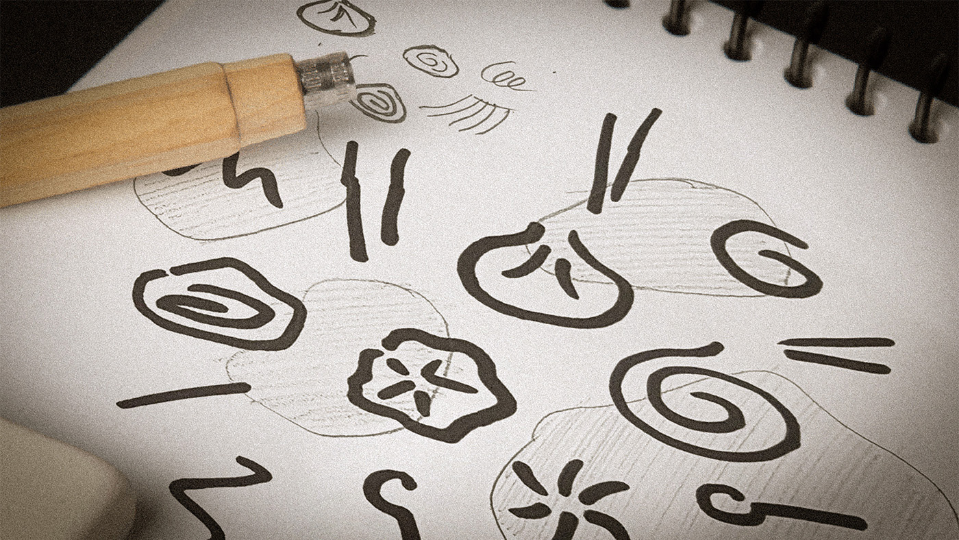
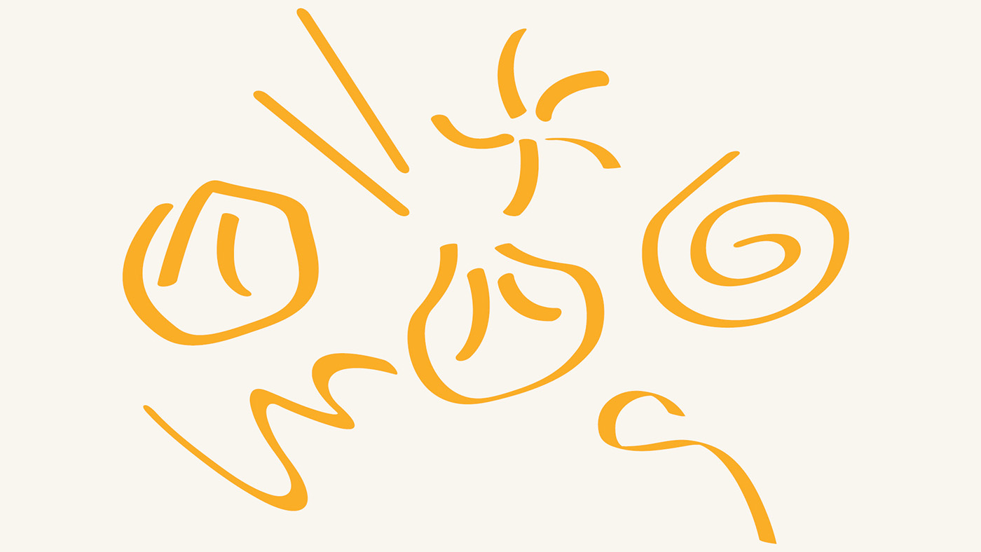
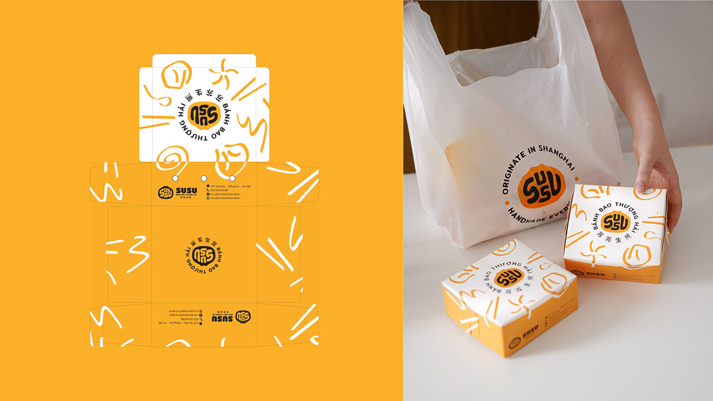
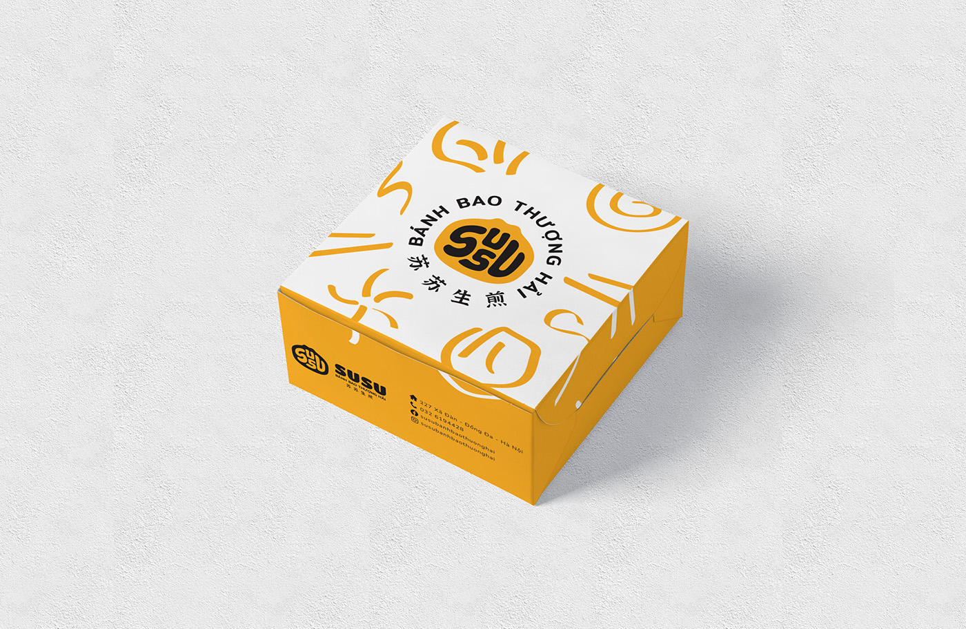
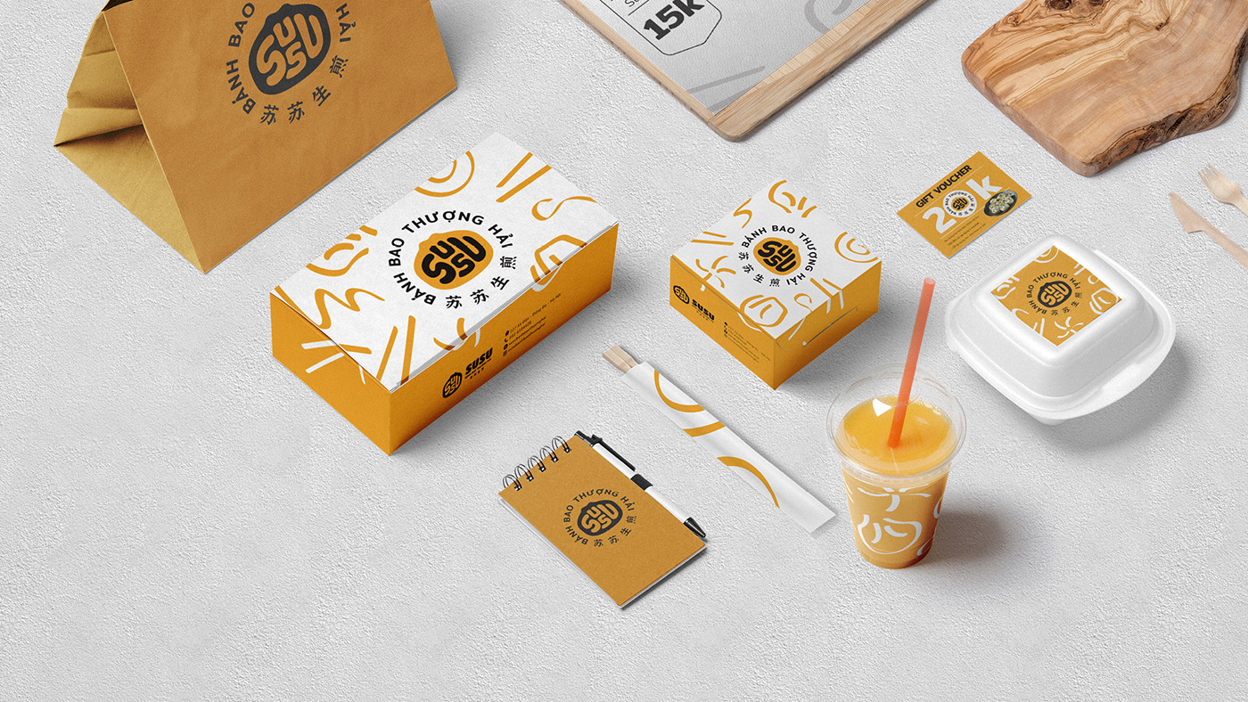
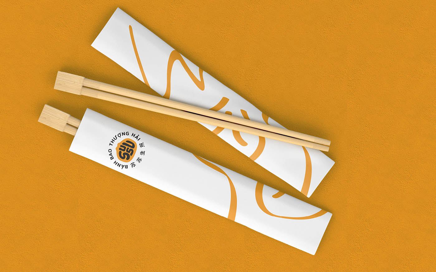
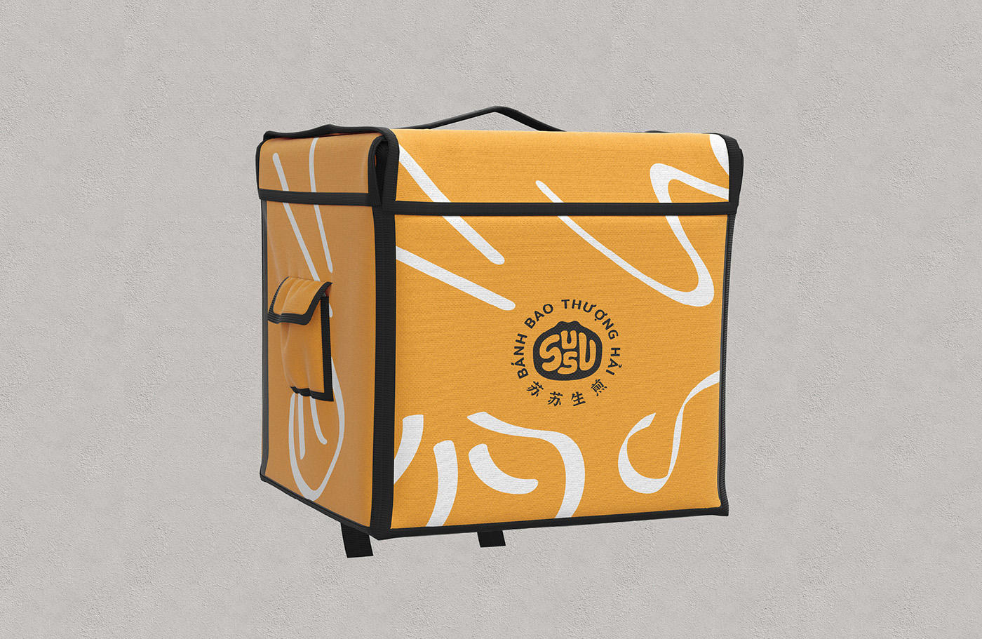
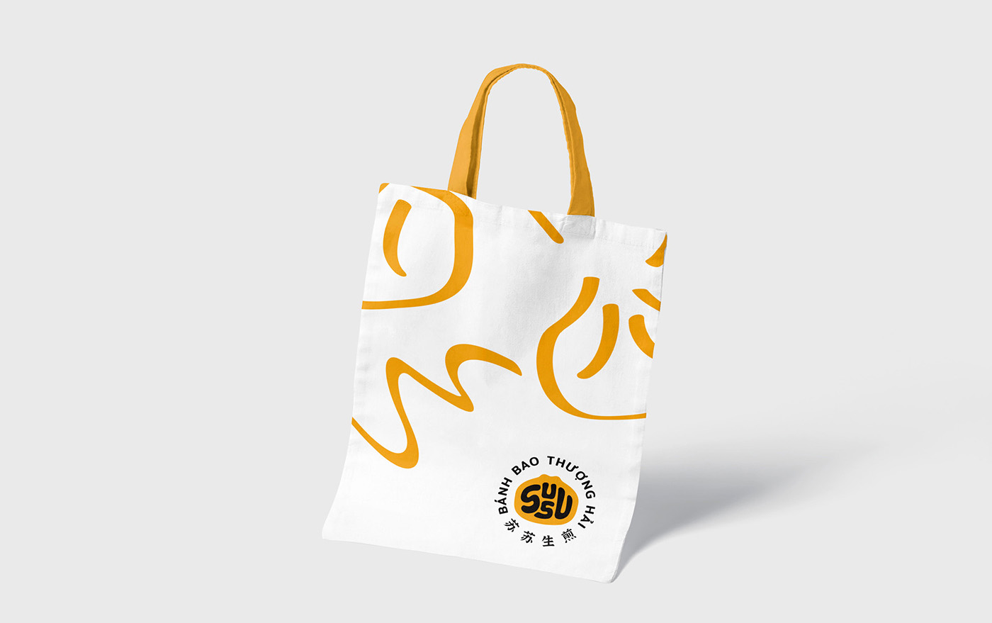
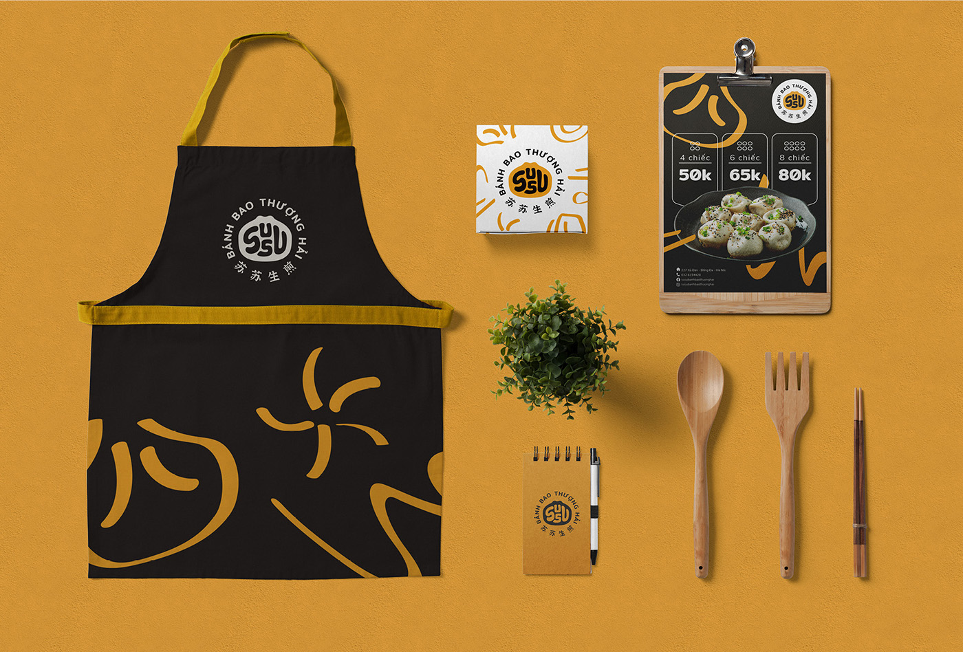
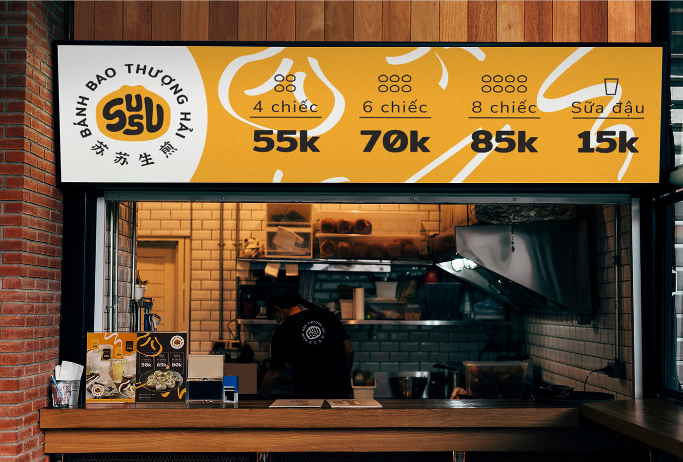
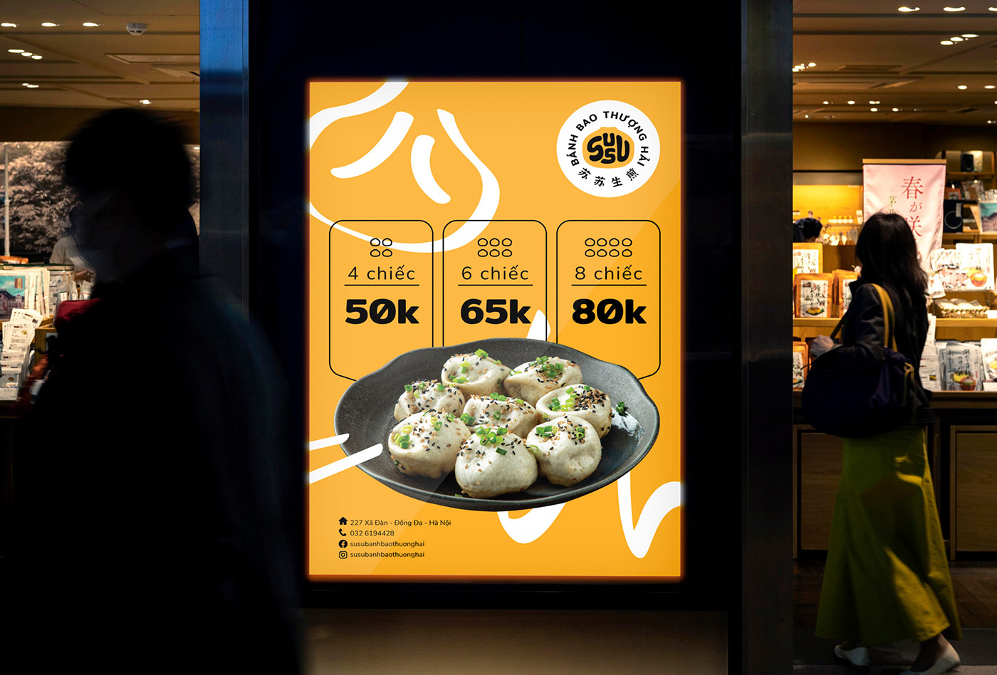
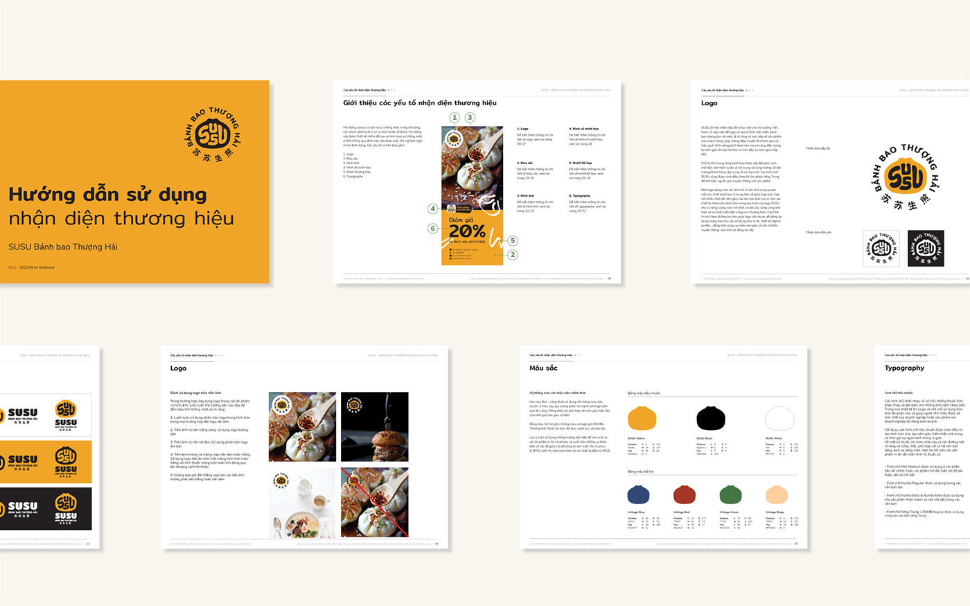
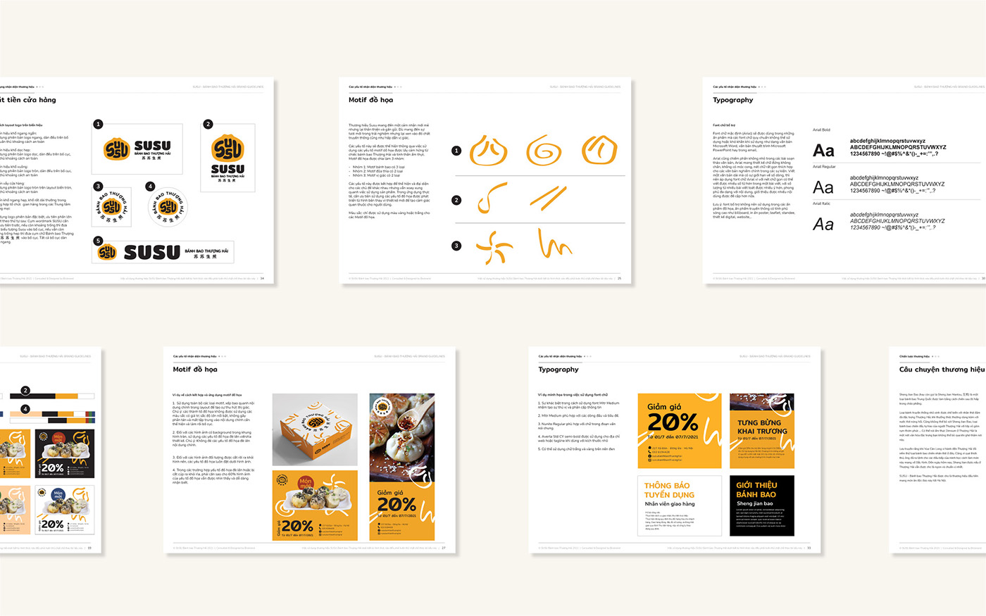
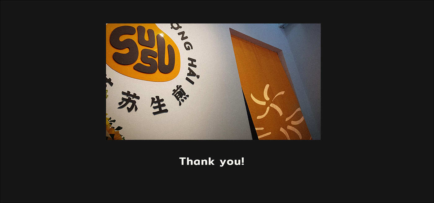
The logo mixes the shape of a bao with the SUSU wordmark, making a simple but memorable icon that ties the name and the product together. We went with a bright, cheerful color palette to reflect the freshness of the ingredients and the restaurant’s upbeat energy. To add some extra flavor, we designed a geometric pattern inspired by the bao’s texture and filling — it gives the visuals a modern, dynamic touch and connects nicely with the logo.
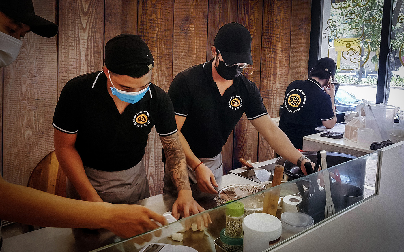
From menus and packaging to signage, uniforms, the website, and social media, the identity comes together consistently — keeping everything aligned with SUSU’s fun, welcoming spirit.